Chemistry J.A.K.H.
Friday, November 11, 2011
Graphing
Today, we learnt to use Excel to show the relationship between variables.
Procedure:
Make a table of values
Base on the values, create a scatter graph
Add
Trendline, and display the equation of the graph
Customize the color of your graph
Slope=Rise/Run
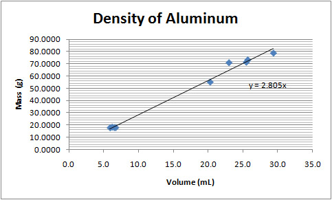
For example, the following graph shows the density of Al:
No comments:
Post a Comment
Newer Post
Older Post
Home
Subscribe to:
Post Comments (Atom)

No comments:
Post a Comment